Hello everyone! I'd like to share an experience I had time ago. I was working on a project involving soccer teams (or football teams, for those outside the United States 😀). Each team had its unique color scheme, which I needed to incorporate as the background color on the detail screens.
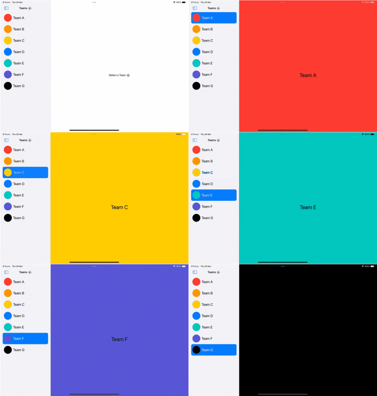
The following gif illustrates the main idea:

I don't know if you got what is wrong here. The problem arises because the detail text, which is statically set to black, doesn't offer sufficient contrast against certain background colors. Specifically, on backgrounds like those of Team D and Team F, the text becomes challenging to read. Even more problematic is the text on the Team G screen, which becomes unreadable!
Some people could say "No problem, let's use white for the text color to solve the issue":

The problem is that screens looking great with black are now harder to read, for example, my eyes hurt when I read text from screen C in background yellow.
To solve this problem, the text color needs to be adapted depending on the background color to generate the best contrast possible and make this UI easy to read.
Continue reading, as I'm about to share a solution that will effectively tackle this challenge 😉.
Calculate Background Luminance
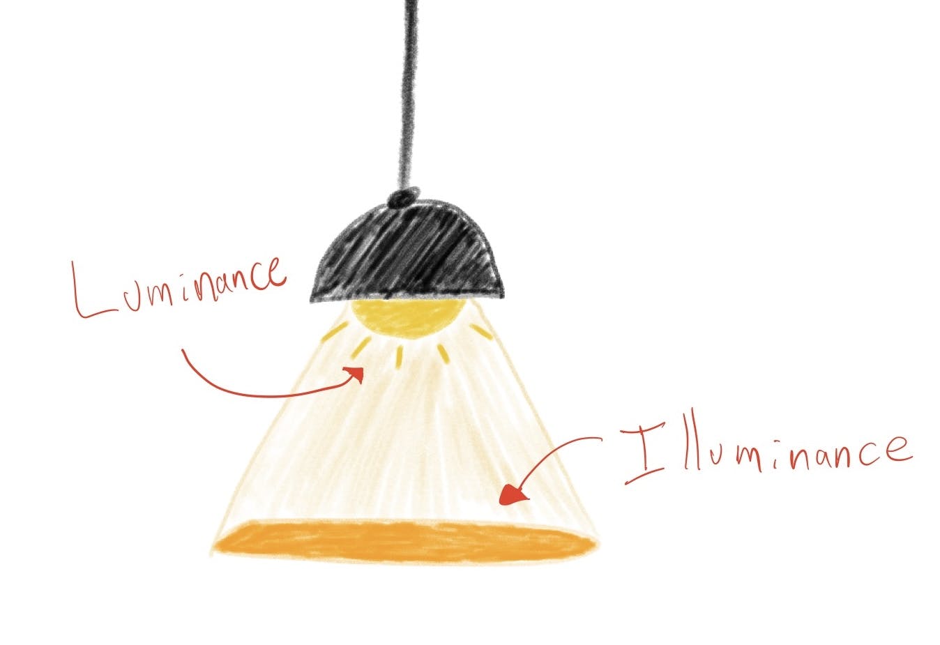
To solve this problem, we will need a concept called "Luminance". Luminance refers to the brightness or light intensity emitted or reflected from a surface, object, or light source (don't confuse it with "Illuminance").
This image visually encapsulates the concept of luminance:

In other words, we aim to measure the amount of brightness emitted by the color. Now the question is, How can we measure that?
The formula to calculate the Luminance of an RGB color is this one:
$$Luminance=0.2126R+0.7152G+0.0722B$$
If you want to learn more about the theory behind this formula, check out this link.
Let me explain the formula:
Each R, G, and B are percentages of "how much" Red, Green, and Blue are contained in the color. This amount is a number from 0 to 255, and to calculate each value, we divide it by 255. For example, if the color is full red, then R will be 1, because the amount of red is 255, and divided by 255 is 1. Each RGB component is a value from 0 to 1.
If we remove R, G, and B from the formula, we will get 0.2126 + 0.7152 + 0.0722. The sum of those coefficients is 1.
Now with this information, Let's calculate the luminance of the white color, where each RGB component is 1:
$$whiteLuminance=0.2126R(1)+0.7152(1)+0.0722(1)=1$$
White is the brightest color that exists, and its luminance is 1. Now let's calculate black's luminance:
$$blackLuminance=0.2126R(0)+0.7152(0)+0.0722(0)=0$$
You guess it, it's zero! Black is the least bright color that exists. It means that Luminance is a value from 0 to 1.
With this boundary set, let's go back to our app and say that a luminance greater than 0.5 means that the background color is too bright, and we should use black for the text color, otherwise, let's use white color because the background is "too dark".
Making text color dynamic
It's time to apply this knowledge to the app. Let's create an extension of Color and create a function to calculate luminance:
extension Color {
    func luminance() -> Double {
        // 1. Convert SwiftUI Color to UIColor
        let uiColor = UIColor(self)

        // 2. Extract RGB values
        var red: CGFloat = 0
        var green: CGFloat = 0
        var blue: CGFloat = 0
        uiColor.getRed(&red, green: &green, blue: &blue, alpha: nil)

        // 3. Compute luminance.
        return 0.2126 * Double(red) + 0.7152 * Double(green) + 0.0722 * Double(blue)
    }
}
To get the RGB values, we have to convert
Colorinto aUIColor.Use
getRed(green:blue:alpha:)method to get the values individually.Once we have the values, let's apply the luminance formula directly.
Now let's create a method to validate if color is light or not:
extension Color {
    func isLight() -> Bool {
        return luminance() > 0.5
    }
}
Lastly, create a function to get the text color that will depend on the background:
extension Color {
    func adaptedTextColor() -> Color {
        return isLight() ? Color.black : Color.white
    }
}
Now let's apply the adapted color in the detail view:
struct TeamDetail: View {
    let team: Team

    var body: some View {
        ZStack {
            Rectangle()
                .ignoresSafeArea()
                .foregroundColor(team.color)
            Text(team.name)
                .font(.largeTitle)
                .foregroundStyle(
                    team.color.adaptedTextColor()
                )
        }
    }
}
Let's see the difference:

Notice how the text changes depending on the background color. This is so cool! 🤩
Wrap up
Hope this information helps you in the future if you have a problem adjusting color, just as it has helped my friend Chris 😃:
Let me know what you think about this trick. Feel free to leave your thoughts in the comments section.
Link to the full demo is here.
Remember, my name is Pitt, and this... this is swiftandtips.com, thanks for reading, and have a great day! 👋🏻
Resources
https://youtube.com/shorts/nlJpnLkLymw
https://en.wikipedia.org/wiki/Relative_luminance
https://stackoverflow.com/questions/596216/formula-to-determine-perceived-brightness-of-rgb-color

